Circular Carousel
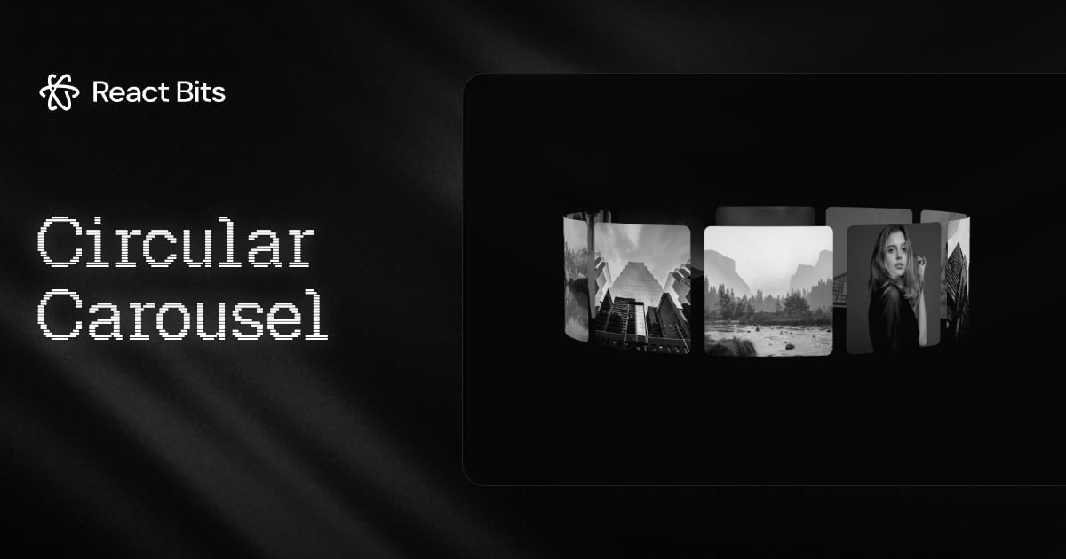
A 3D ring of images with bendable cards, momentum drag, snapping and click to focus.
Use Circular Carousel in your project
Choose JavaScript or TypeScript and plain CSS or Tailwind. Enable JavaScript for the interactive preview, customization controls and source tabs.
npx shadcn@latest add @react-bits/CircularCarousel-TS-TWRelated components
- Depth Carousel
Cards recede into depth on a 3D rail, with drag, keyboard and auto-advance.
- Stack
Pile of cards you can drag, flick or click through, with thrown cards tucking underneath.
- Carousel
Swipeable cards for feature tours, stories and galleries, with five transitions and an autoplay timer.